Responsive design for web based games
[November 2022]What it's like to build a browser game for mobiles, how we face up to the challenges, and why we still think browser games rock.
If you're anything like me, you've signed up for dozens, maybe hundreds of online games. The average play-time of a new player on a text-based browser game is remarkably short. We can speculate a lot about why that is, but one thing usually stands out in our market research. 68% of the new players we've spoken to and gained feedback from have said that game layout and navigation is one of the biggest challenges they face. Checking out a game that's clearly designed for desktop when you're on a mobile device can be very frustrating. The same is true in reverse. Navigation is difficult, and it's hard to know where to begin as a new player. Lots of text-based games just look dated. How can we overcome that?
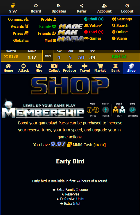
Throughout this blog post, we will use experiences on Made Man Mafia (MMM) to illustrate our points. For reference, MMM is played in rounds where players accumulate turns to perform most actions in the game. When a round ends, players are ranked based on their progress and win prizes. It also combines real time elements that contribute towards individual and multiplayer rankings. If you want to learn more, click "Register" in the page header, or sign up for a free account here.
The screen real estate challenge
This competitive nature of MMM requires that players can keep track of the game situation. This means that pages for ranks, player info, and multiplayer aspects need to be easily accessible. For a desktop user, there's plenty of space for all these links. If you're playing on a mobile device though, your screen can quickly get swamped with confusing links. Screen real-estate on a mobile device is at a premium, and we don't want everything above the fold to be navigation. On a feature-rich game, we really need to balance the ease of navigation with its footprint.

How not to do it
Hiding links in a collapsible menu. While this does a good job of freeing up space, it's important to be able to access these links quickly. This method not only adds an extra click, but has a transition time to expand the links. We want to encourage players to play the game on mobile devices, not punish.
Desktop vs mobile for browser based games
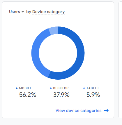
One could be forgiven for thinking that "retro" browser games would still have a majority of users on desktop; After all, many browser games are pretty old-fashioned. Well it turns out that's not the case here. MMM is designed to be responsive, and truthfully, isn't fantastically optimized form mobile devices yet. And yet, more than half of users are on mobile. To design a game without that cross-section of players in mind is horribly short-sighted. Designing for desktop only is the easy way out, the path with least resistance. And sure - a desktop optimized browser game will look really nice. You do run the risk of turning away a large chunk of potential players if you don't make it playable on mobile though. What's the point in a game that nobody plays?

MMM users: 56% use mobile devices.
Responsive design. vs App version + Web version
The logical choice then is probably iOS - Android - web version triple. Yes, having dedicated mobile store versions would be fantastic. Having the opportunity to send players push notifications is justification on its own. Yet, to maintain three versions and build more is pretty difficult for a solo developer.
By employing responsive design techniques, neither version ever really looks perfect but there are benefits:
- Main differences between desktop and mobile versions can be controlled easily with CSS.
- A single development stream frees up time to build more and better new features.
- Retention of the "always available" nature of the web browser.
- Deliver better customer service by having a single support system.
Responsive game design principles
Use a sticky header
Using a sticky header to keep important elements visible. This stops players from having to scrol back to the top after scrolling down a page.
Don't hide too much
Avoid hiding links on mobile versions. Giving mobile users a stripped down version of the game is not desired.
Shrink images
It's good for reducing server load, and not using too much network data for mobile users.
Use Icons
If you have a lot of links, improve the readability by giving each an icon. Yes, they take space but many concepts can be enhanced with an icon which improves navigation.
Work out what features are available
Can I Use...? is a great tool for deciding whether to implement an element into your game. Mobile browsers usually lag a little behind desktop in terms of supported features, but the gap is closing.
Keep Updating
We've done several updates to the layout of MMM, each iteration improves the way things work cross-device. We do still have issues with cramped links on mobile and will look to improve that too in time. Bottom line: keep improving, nothing starts out perfect!

Thanks for reading!
If you want to know more about MMM, take a look around with a free account. Feel free to use our "Join us" links below to connect with us on Skype or Discord to discuss game-building. Enjoy your day!
